What's in a name? - PART 2
Part of my strategy for preparing to transition to a full time photog is to present my business in a professional way. This site is part of that strategy. While its current primary mission is to inspire me to continue improving my photography skills, it also serves as a vehicle to deliver digital content to customers and models. Notice the name of this site is www.imagesbydesign-us.com. It's a little clunky with the -us at the end. I wanted www.imagesbydesign.com. That domain is currently owned by a Canadian marketing and business development company but isn't in use as far as I can tell. I've contacted them several times with offers to buy it from them but my requests have gone unanswered.
I own the domain setzer.photos, but when I created Images by Design I stopped advertising that. I've also registered imagesbydesign.org. The .org top level domain was created originally for non-profit organizations so it's not the most fitting for my long term plans - even though I see some for-profit entities using it. As I write this, if you type either setzer.photos or imagesbydesign.org into your browser you'll end up back here. If I can manage to buy that imagesbydesign.com domain I'll surely jettison these since I don't want confusion among potential clients or customers.
I just recently added an email service to the imagesbydesign.org domain, updating my accounts on all photo related sites to jim@imagesbydesign.org so I can track all that correspondence in one place. As a side benefit, if you are a subscriber who uses Google Chrome browser, you should now see these blog posts come into your inbox under Social instead of Promos.
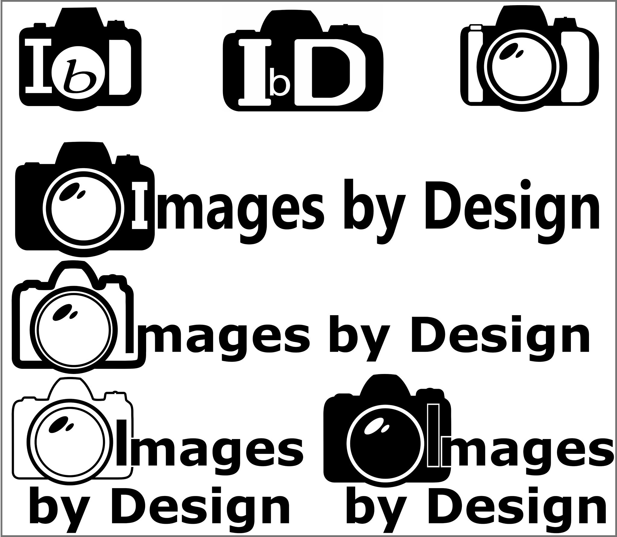
If you've been following here since the blog began, you might have noticed that I've updated my logo a few times. It's still not exactly what I'd like but it's getting there. There's a lot of psychology behind logo design so I feel I need to get this just right. A great logo conveys the spirit of your company more than people think. There's a reason the McDonald's arches are "golden." Shapes convey different messages about your company as well. Denise's "Healthy Living" logo was a piece of cake compared to this one.
I'd greatly appreciate any feedback on all this badging and branding. Which ones work or not, or does it not matter all that much to you? And we're still looking for a better title for this blog, so any ideas about that are welcomed too.

